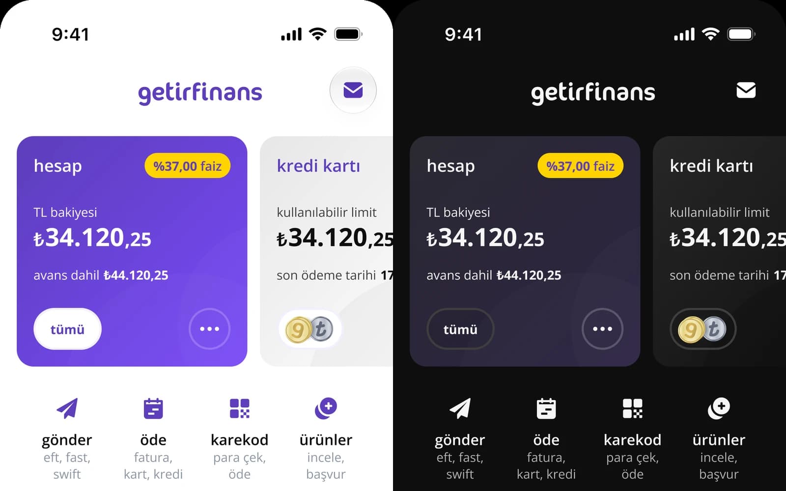
GetirFinans Design System
GetirFinans started as a product inside the Getir super-app: light mode only, inheriting the parent shell's conventions. The color foundation was a flat variable list named by appearance (GrayPrimary, OffWhite, DarkPurple, PalePurple, FintechGreen). No primitives, no semantics, no mode awareness. Design lived across 20 independent domain Figma files with no component sync protocol. Then leadership asked for dark mode.
Most design system case studies show a system that was never load-bearing. This one was rebuilt underneath a running product, and the constraint that forced it is the same constraint that proved it worked.
The Legacy System
The starting color system was a flat list: Getir-Primary, GraySecondary, PalePurple, FintechGreen. Names described visual properties, not intent. No primitive/semantic separation. No mode awareness. It worked well enough for a single-mode app living inside a larger shell.
Hardcoding values and branching on isDark inside every layout file is how design-system debt compounds. Dark mode becomes an audit, styles duplicate, and a brand change touches hundreds of call sites.
// ✕ Legacy — the component owns theme logic
import { useColorScheme } from "@/hooks/useColorScheme";
export function ConfirmButton() {
const isDark = useColorScheme() === "dark";
return (
<button
style={{
backgroundColor: isDark ? "#2A2342" : "#5D3EBC",
color: "#FFFFFF",
borderColor: isDark ? "#5D3EBC" : "#EAEAEA",
}}
>
Onayla
</button>
);
}Governance debt. A single color change (say, replacing brand purple) means editing every conditional style across the codebase.
System Architecture
The foundation is a two-tier token system: primitives carry values, semantics carry intent.
Primitives are raw palette scales: purple-light.50, neutral.900, cool-gray.500. They don't carry meaning, just values.
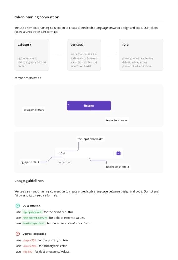
Semantics follow a {property}/{context}/{variant} pattern: bg/surface/default, text/content/primary, border/input/default. They describe what a color does, not what it looks like.
The token collections are primitives, semantics, and [legacy]. The legacy collection is kept deliberately during migration: it lets 20 domains migrate incrementally instead of in one synchronized big-bang refactor.
Modes (light and dark) are resolved at the semantic layer. A semantic token's identity is stable; only its primitive binding changes per mode. The system spans three platforms: web, iOS, and Android.
Combine a category, concept, and role to build a semantic token, then inspect how it resolves in each mode.
Namespace isolation: bg/ai/*, text/ai/*, and icon/ai/* form an isolated namespace for AI surfaces. The rationale is architectural, not aesthetic. AI surfaces were sharing semantic tokens with error and success states. In light mode the collision was invisible. In dark mode it broke. The principle: when two things share a token by coincidence rather than by intent, they will diverge eventually. Isolate early.
The dimensional layer, honestly stated: spacing (9 steps: 0/4/8/12/16/24/32/48/64), size (10 steps, including a 2-step touch target scale), radius (8 steps), and breakpoint (3 steps) primitives are built. Semantics exist for color only; the dimensional primitives haven't been promoted into the semantic collection yet. This is a deliberate sequencing decision: color was the layer under production pressure and the layer where a mistake is visible to every user. Ship the semantic layer where it's load-bearing, build primitives beneath the rest, and promote them once the naming has been proven by the color layer. The color system is the template: same two-tier shape, same slash-delimited naming.
Three design decisions define this architecture.
Brand invariance: bg/action/primary resolves to #5D3EBC in both modes. Brand is a mode-independent anchor. Most fintech dark modes oversaturate the brand color into large fills; here purple lives at the stroke, accent, and border layer.
Status colors range-switch, they do not invert. green.50 in light mode becomes green.900 in dark mode: same semantic role, different scale position. Semantic equivalence across modes is not positional equivalence in a scale. This is the intellectual center of the case study, and the precise reason the original brief was wrong.
Keeping the legacy collection alive: deleting it would have forced a synchronized migration across 20 domains. Keeping it made migration incremental and reversible.
Chapter One: Dark Mode as the Forcing Function
The brief from product and engineering was direct: "give us dark mode equivalents of our colors." That framing is wrong. Dark mode is not an inversion of light mode. A 1:1 hex mapping breaks status colors, collapses elevation hierarchy, and produces surfaces that are technically darker and perceptually wrong. Resolving the framing before designing anything was the first real design decision.
The dark palette: canvas #0E0E0E, near-black with no blue bias and not pure black. Surfaces at #1A1A1A and #262626 in tight steps: flat and dense rather than heavily elevated. Status colors sit in the 900 range, muted, with no neon-on-black. Reference points: Apple HIG as primary, Revolut and iOS system apps for comparison.
Engineering's initial resistance was correct on its own terms. Refactoring 20 domains is expensive and the brief asked for hex values. What changed it was showing them the token system from their side: fewer conditionals, one source of truth per semantic role, cleaner handoff. They became advocates.
Where the Token System Ran Out
These are boundary conditions of a token architecture, not failures.
FX line chart: the SVG stroke was hardcoded in markup with a Display P3 fallback. The fill gradient required a conditional SwiftUI render path (an isDark environment check, separate gradient values per mode), not a token swap. The root cause: the token system is single-value. Data visualization needs ordered palettes, contrast guarantees, and multi-series logic. Colors designed for UI surfaces were reused for data. Charts were never modeled as a semantic domain.
Google Maps runs on a separate JSON style file the token system doesn't reach. Purple was tried on base tile geometry and explicitly removed; the final version is neutral geometry with purple reserved for overlays and markers.
Lottie color management sits outside the token system entirely: parallel animation files or layer-level overrides. Android constraint: layers nested inside precomps don't support runtime color override.
Liquid glass on the home action grid was evaluated and rejected: contrast failure in dark mode, and it doesn't satisfy HIG intent for static containers.
bg/ai/primary in dark mode is #2B2438, a desaturated dark purple, not an inversion of the light value. Dark AI surfaces needed to feel contained and premium, not just dark.
Yatırım Dünyasında Yeni Eğilimler
Yapay zekânın portföy yönetimindeki yeri ve geleceği.
The Governance Failure Dark Mode Exposed
Core UI icons were exported as PNGs per domain and uploaded to separate Directus CDN buckets. No versioning, no registry, no token injection possible at runtime. Dark mode required a full parallel set of PNGs: the same icon existed across 6+ CDN locations, each needing a manual re-export.
This was never a dark mode problem. It was a governance problem that dark mode made impossible to ignore. Every theming decision carries that tax until icons migrate to SVG.
A Slack tracking list (name, domain, CDN link, type, request owner, status) was the operational workaround. It documented the absence of a system, and that documentation became the business case for building one.
Documentation as an Artifact of the System
gf-design-system.vercel.app is a Next.js documentation and education site, live and in active use by the team. The color section alone is 7 pages: introduction, primitives, semantics, reality, dark mode, overlay, and gradients.
The "reality" page documents the gap between the system as designed and the system as implemented in production right now. Most design systems hide this. Publishing it is what made the migration tractable.
The repo split (design system source and documentation, previously one monorepo) was a governance decision, not a technical one. The reason is the argument: if documentation can drift from source, the documentation is a claim rather than evidence. The docs site consumes published token packages, so it cannot describe a token that doesn't ship.
Beyond the site: facilitated token usage sessions across the design team, wrote implementation guidelines, and educated designers on the two-tier model.
Semantics
{property}/{context}/{variant}. bg/surface/default, text/content/primary, border/input/default — what a color does, not how it looks.
Proof
The new bottom sheet, designed after the token system shipped, is the clearest proof of what the system enables. Every color decision is a semantic token reference: no hardcoded values, no one-off overrides. Light and dark are one design file with a mode toggle. That is the difference between adapting a product to dark mode and building a product that understands it.
Transfer İşlemi Başarılı
₺2.500,00 Ulaş Alyeşil hesabına gönderildi.
GetirFinans'ı seviyor musun?
Dürüst görüşün bizi daha iyi yapar.
Results
This is a live system, still migrating. Rather than publish soft numbers, the hard metrics are being confirmed against production before they go here — the same “evidence, not claims” standard the docs site holds itself to.
- Exact primitive + semantic token counts
- Docs site total page count
- Domains migrated off the legacy collection (of 20)
- Whether WCAG contrast was verified systematically
- A publicly stateable active-user number
What's Next
Semantic dimensional layer: promote spacing, radius, and size primitives into semantics using the existing names. Don't redesign the ramp. Publish.
Component tokens: no component tier exists today. It's the layer above semantics and it isn't built yet.
Icon migration: PNG to SVG, killing CDN bucket sprawl and unlocking runtime theming.
Data visualization tokens: charts need a modeled semantic domain (ordered palettes, contrast guarantees, multi-series logic). The FX chart is the open ticket.
Component library: downstream of all of the above. It doesn't start before the foundation carries weight.
Reflection
What worked: sequencing color first (the layer under production pressure, the layer where errors are visible to every user, and the naming template for everything after it). Publishing the gap: the reality page and the Slack tracking list both documented the distance between design and implementation, and making the debt visible got it funded. Isolating the AI namespace early rather than redefining shared tokens under pressure. Bringing engineering in by showing them the system from their side: the token system's best argument had nothing to do with color.
What I'd do differently: audit color usage in context before designing anything. Elevation problems surfaced during implementation instead of before it; a screen-by-screen audit of how colors were actually used, not how they were named, would have caught them. Model charts as a semantic domain from the start rather than reusing surface colors for data. Finish the dimensional semantic layer alongside color rather than leaving primitives promoted but unmapped. The gap is defensible. It was still avoidable.
I rebuilt the color foundation of a live fintech product, solo, while convincing the team that the problem was never dark mode. It was the system underneath.