Consiligiere (freelance)Investor concept, not launched
A marketplace for verified professionals, from brief to both sides
- Role
- Product Design, Visual Direction
- Timeline
- December 2025 — January 2026
- Company
- Consiligiere (freelance)
- Team
- With Eylül Deniz Kızılay (eyluldeniz.com), for the founder
- Platforms
- Landing page, customer app (iOS), provider app (iOS and web)
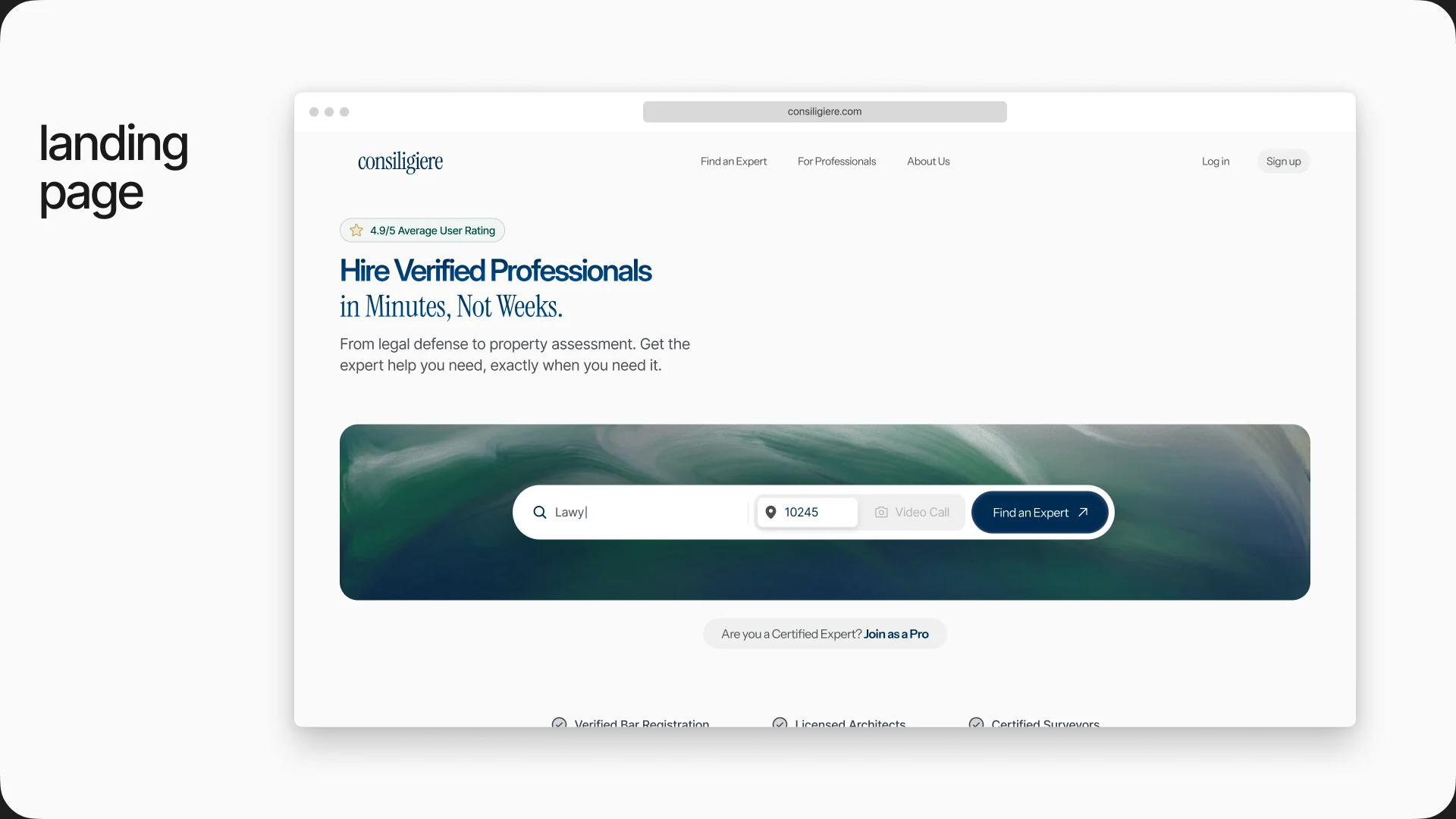
Consiligiere connects people with verified lawyers, notaries, tax advisors, architects and surveyors, then keeps the whole job on one platform: booking, the video call, documents and payment. The founder needed the product to exist visually before an investment round. Eylül and I set the visual direction, designed the landing page, and designed both sides of the app: the customer looking for help and the professional running a practice. We worked together on every phase, from concept to execution.
The brief
A spec for a look, not a product
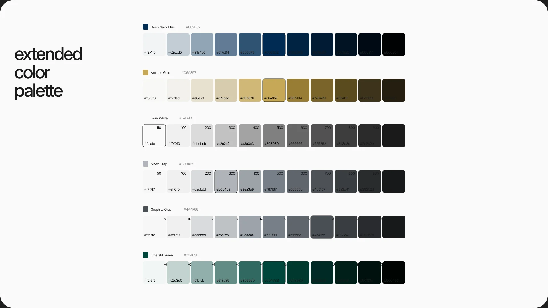
The brief came as a PRD. It named the palette (deep navy and antique gold) and the typefaces (Cinzel and Playfair), and said “Clean Luxury”. We treated it as input, not as a spec, and tested it before building on it.

Exploration
More than twenty landing pages to find the product
The first direction moved away from the PRD on purpose: warm cream instead of white, and one earthy color per profession, so a person looking for a property valuation could look for terracotta instead of reading labels. Gradients and a lighter “super-app” version followed.
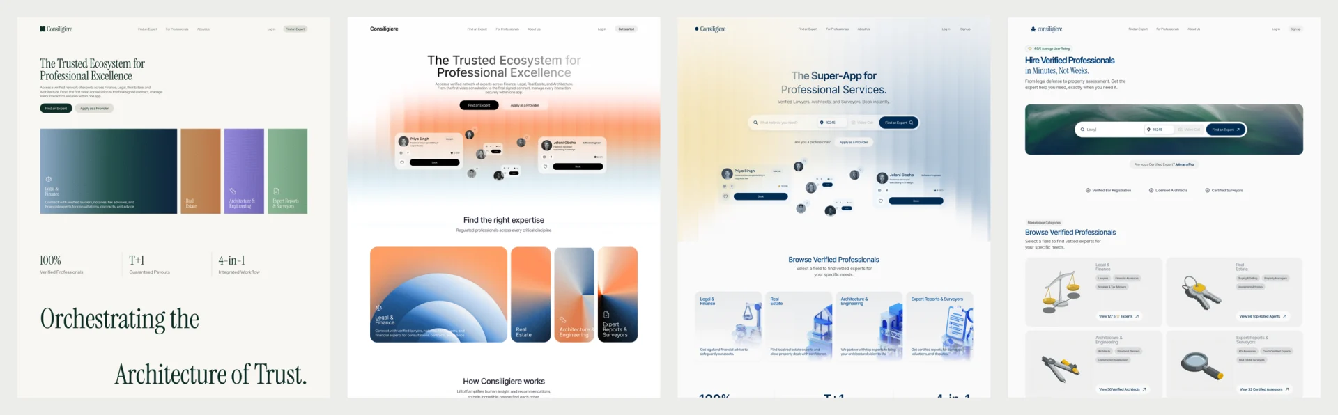
Then we reworked the palette around who the product is for and how it needs to be seen: a serious place for legal and financial work. That brought navy back, and the professions are now told apart by object instead of color: scales, keys, a compass, a magnifying glass.
The system
Keep the authority, fix the type
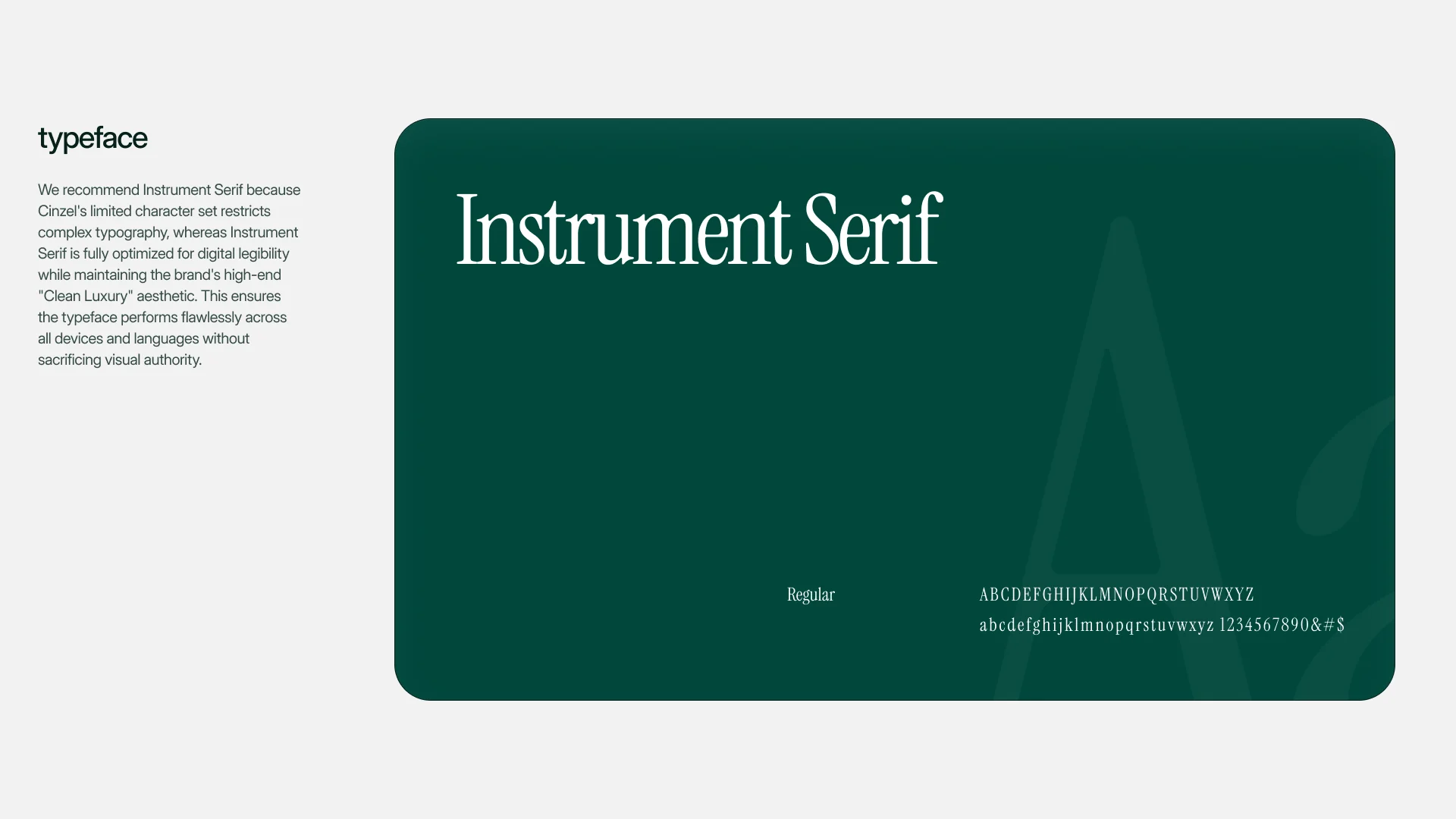
Cinzel reads like an inscription, and its character set is limited, which breaks down in a product with long names and mixed languages. Instrument Serif keeps the editorial tone and holds up on screen. Inter Display carries everything that has to be read quickly.
Customer app
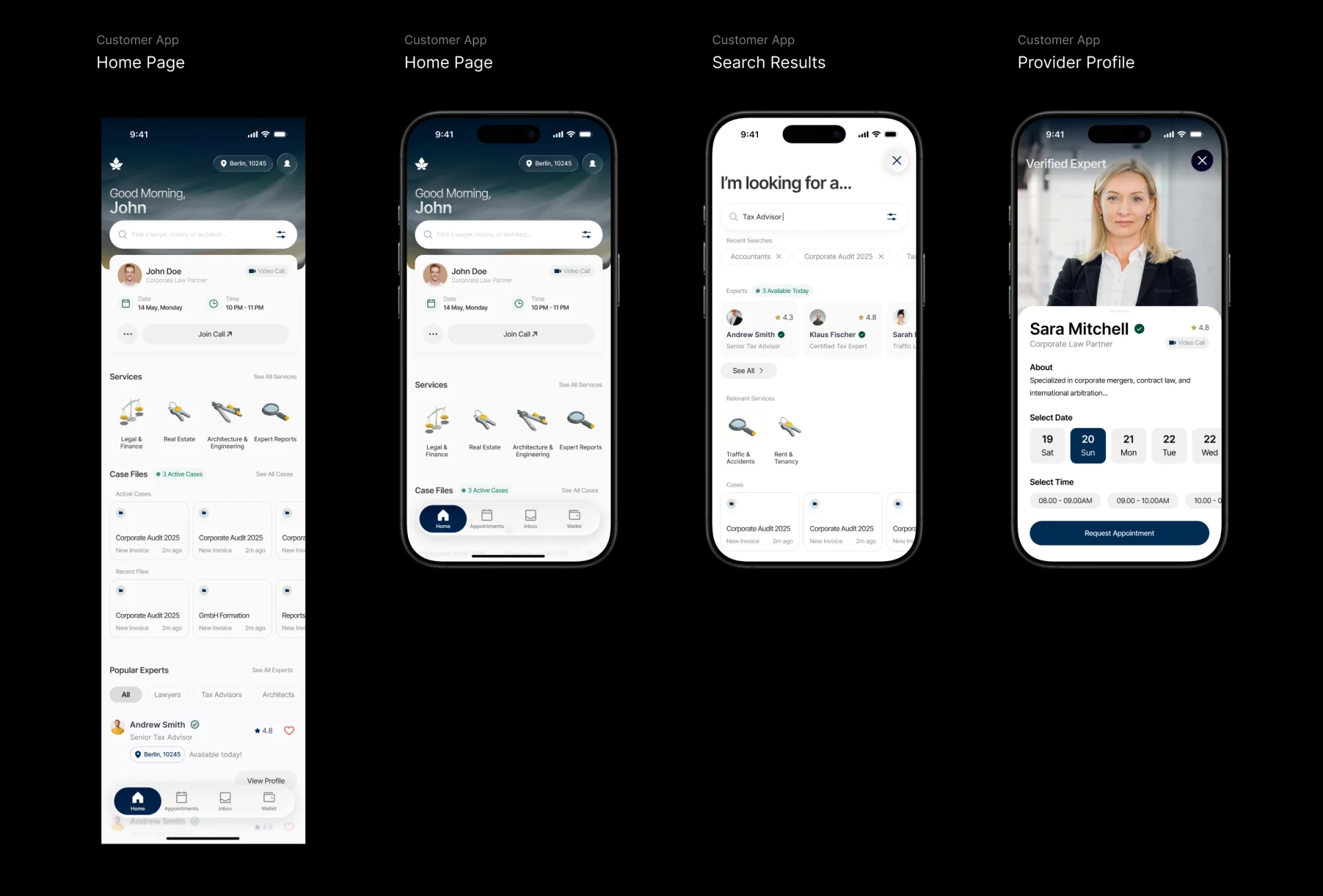
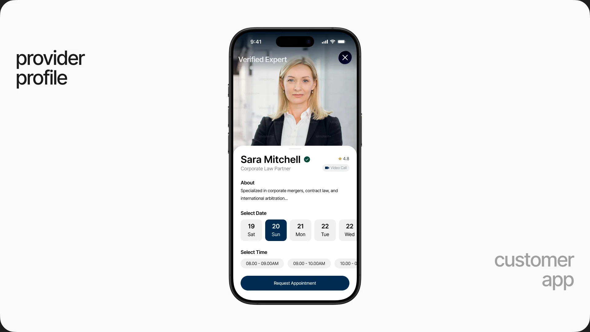
Book from the profile, not after it
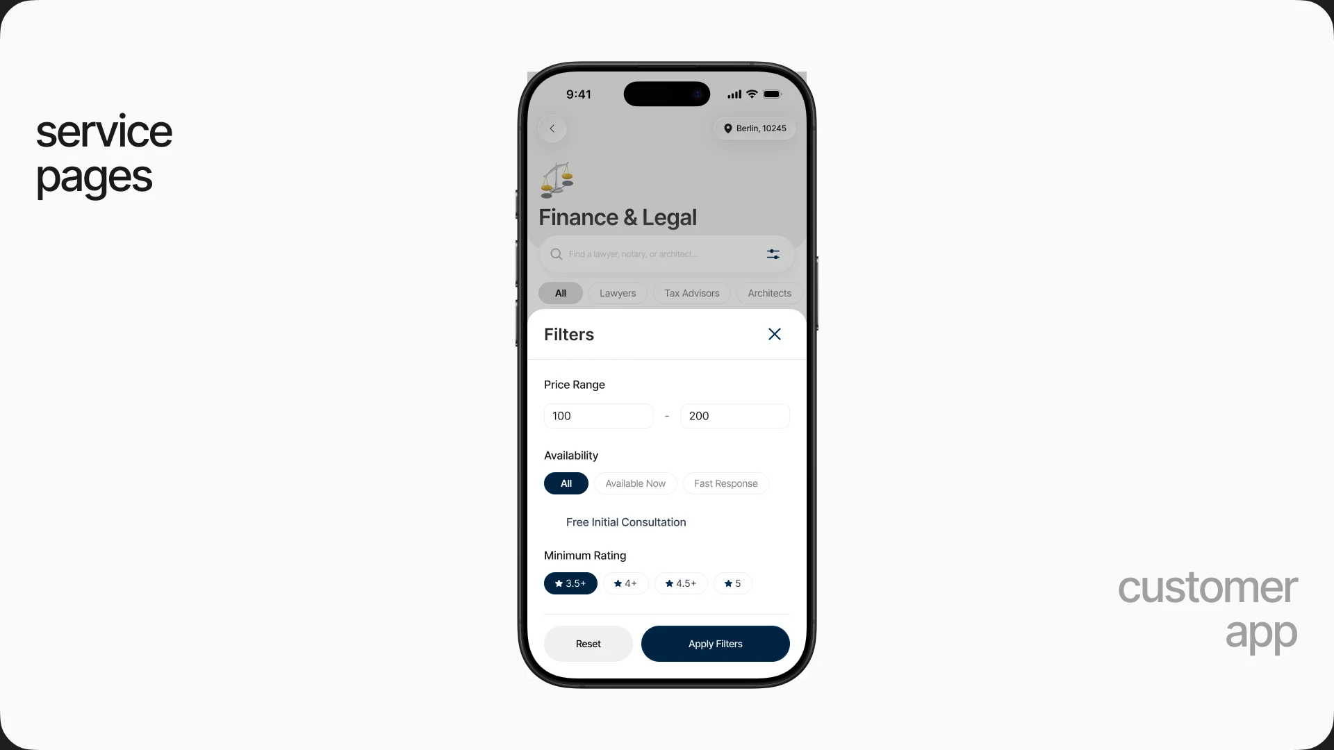
A profile answers the question a person actually has, can I talk to this lawyer this week, so dates and times sit on the profile itself and the only action is Request Appointment.
Provider side
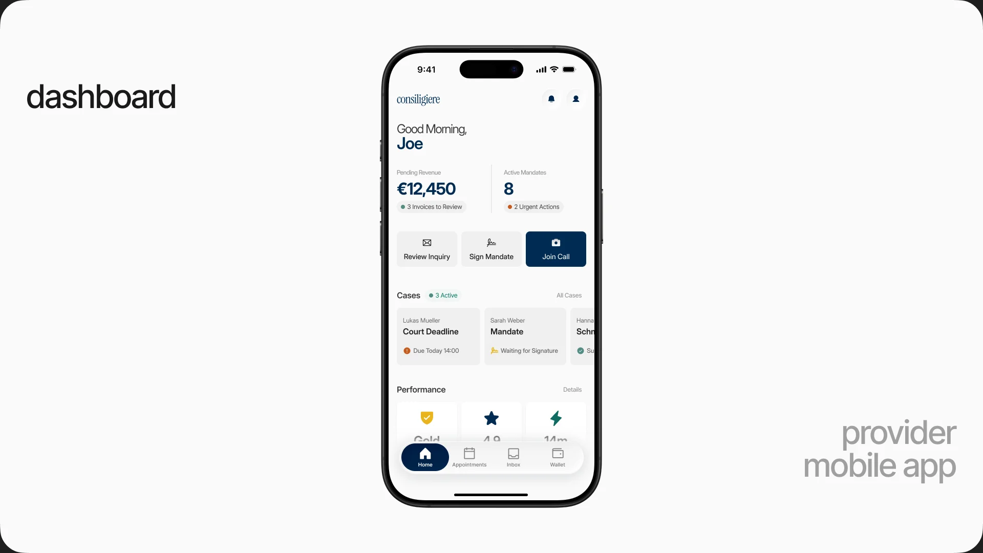
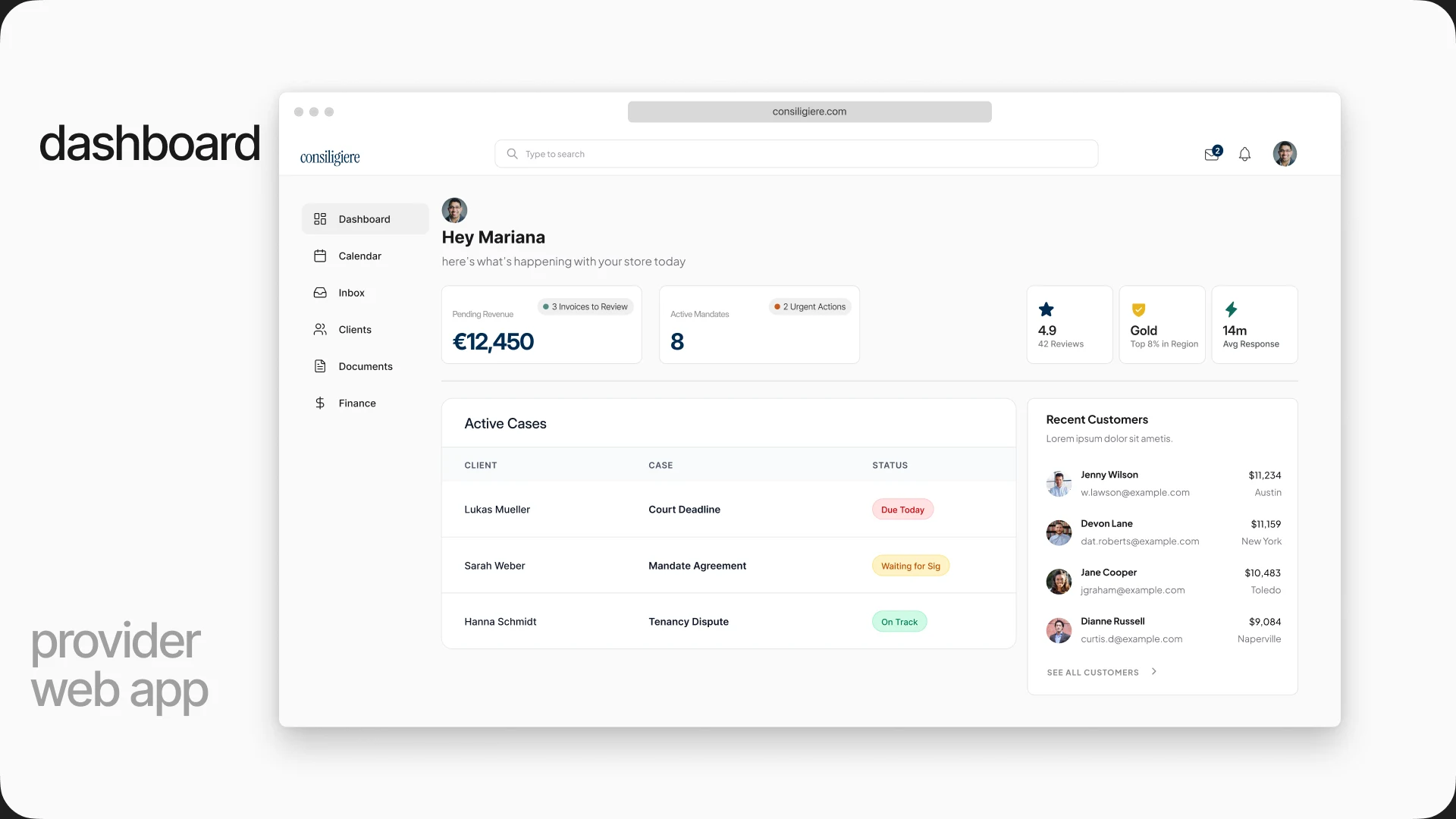
Give professionals a reason to stay
A marketplace like this fails when client and professional meet once and move off the platform. So the provider side is a place to run the practice: pending revenue, mandates waiting for a signature, court deadlines due today.